CCRLRA

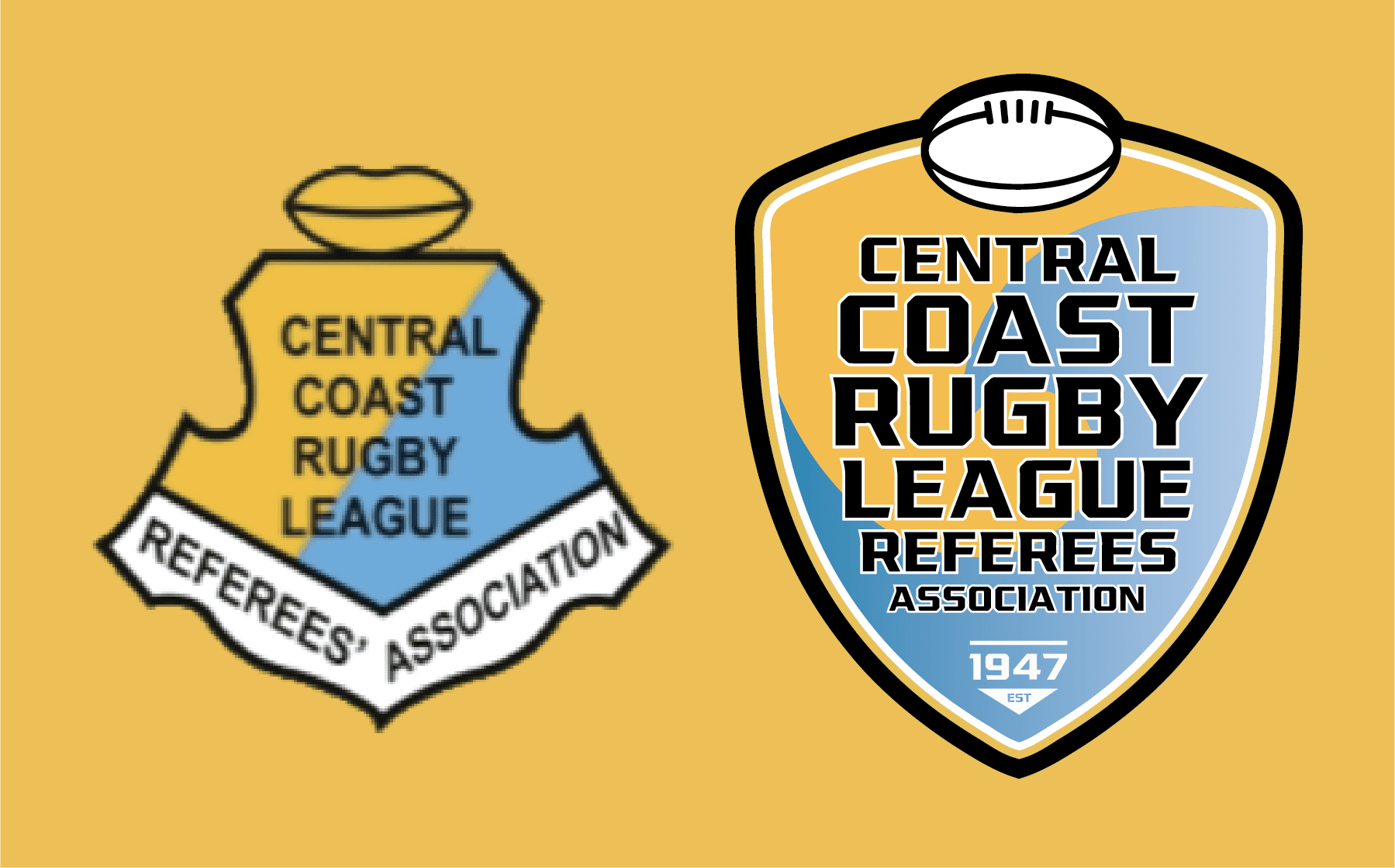
The Central Coast Rugby League Referees Association (CCRLRA) is the exclusive supplier of referees to rugby league fixtures on the Central Coast, and has done so for the past 75 years. The Association has a proud history and a current membership of 73 referees, ranging from 13 to 81 years of age.
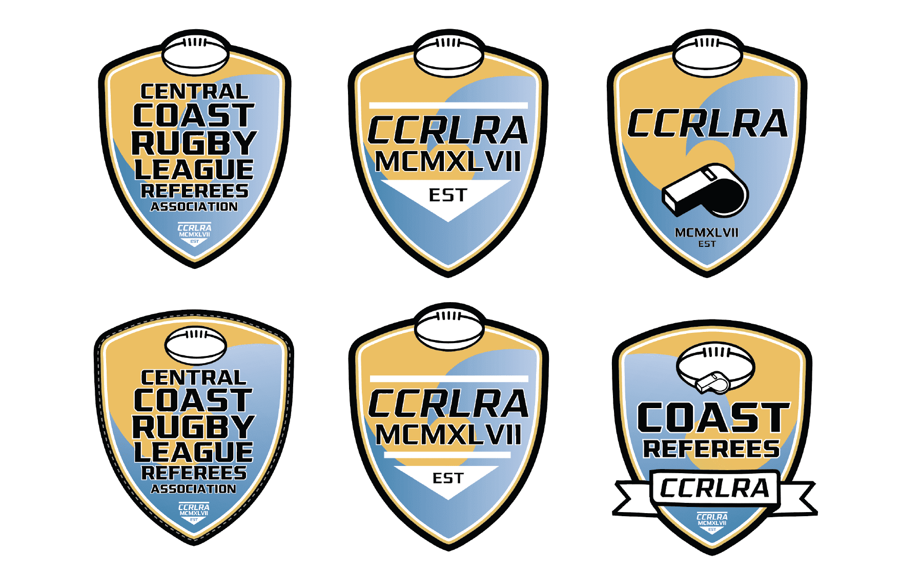
CCRLRA required a Logo Rebrand for their association which had remained unchanged for many years.

INTAKE

Rebranding is an important process for any business, and ensuring that the new logo pays homage to the old one is an essential part of that process. In the case of CCRLRA, we wanted to update the logo to a more modern look, but still keep some of the key details from the old logo. To do this, we kept the angled dividing line between the yellow and blue colors, and updated the silhouette to a more modern look. We also opted for a strong action sports based font to round out the modernisation.

compression

The rebranding process began with an analysis of the current logo and how it could be improved. The first step was to simplify the overall design, making it more modern and streamlined. The next step was to update the color palette, opting for a gradual gradient contrast for both colours, thiss technique add's depth and makes the design pop.

combustion

Finally, the decision was made to add a badge-like border with a football motif, paying homage to the older logo style while still appearing fresh and new. Overall, the rebranding effort has resulted in a logo that is more visually appealing and easier to use across all areas of the association. From print to apparel, the new logo is sure to make a lasting impression on members and fans alike.

Exhaust

In rebranding CCRLA, it was essential to consider all facets of the association being represented. This includes not only the skills and services offered, but also the history, mission, and values. With this in mind, the rebranding of CCRLRA involved a careful evaluation of all aspects of the organization. The result is a logo that is both recognizable and contemporary. It is a powerful symbol that accurately represents the Football Association and its core values.

The clean lines and bold colors create a modern look that is both professional and approachable. In addition, the logo is highly versatile and can be used in a variety of applications. Overall, we believe the new logo is a strong reflection of the CCRLRA's rich history and will serve as an effective tool in its future growth and outreach efforts.

YOUR BRAND IS AN ENGINE.
YOUR BRAND IDENTITY IS ALL THE MOVING PARTS THAT MAKE UP THAT ENGINE.

And Four-Stroke Creative is your brand mechanic.
You're not just a client. You're a partner, We're not just a creative agency. We're a group of likeminded people with a passion for crafting unique brand experiences that accelerate & excite.

When it comes to engines, the goal is always smooth operation. And at Four-Stroke Creative, we apply that same philosophy to our approach to success. Just like a four-stroke engine, we carefully plan each phase - or stroke - of a project, from intake to compression to combustion and finally exhaust.

This methodical process allows us to consistently deliver high-quality work that surpasses expectations and fuels our clients' success. And just like an engine's emissions, our impact is clean and sustainable, leaving a positive mark on the industry and community. At Four-Stroke Creative, success looks like seamless execution and lasting impact.
So why not rev up your next project with Four-Stroke Creative?
So whether you're just starting up, or your ready for a refresh, Contact us today to see how we can help fuel your brands success. Get in Touch today.

book a brand mechanic today
Contact
linkedin facebook pinterest youtube rss twitter instagram facebook-blank rss-blank linkedin-blank pinterest youtube twitter instagram